Project Overview
The Product
Sekto is a digital banking platform that helps users manage Personal, Business, and Freelance accounts seamlessly. It’s designed for people who value simplicity, transparency, and control in their finances.
Duration
Role
Tools
June 2025 – November 2025
UX/UI Designer
Figma, Miro , Google Forms
The problem:
Users found it difficult to open accounts without visiting a physical branch and couldn’t easily track their transactions in real time. This project aimed to create a seamless digital experience for account setup and transparent money management.
The goal:
The goal was to design a banking solution that allows users to open and manage accounts digitally, track transactions in real time, and navigate their finances with ease and confidence.
The Process
User Research:
To better understand the needs of modern digital banking users, I conducted a user interview with Lindiwe, a 31-year-old freelance graphic designer. Going into the research, I assumed that convenience and speed would be her top priorities. However, the interview revealed that trust, transparency, and clear communication were just as essential. These insights informed a design direction focused on building user confidence through a secure, guided, and user-friendly online banking experience.
Initial Key Insights
1. Most banks are built for salaried users, not self-employed individuals with irregular income
2. Finds it time-consuming and frustrating to visit physical branches for tasks that could be handled online
3. Gets frustrated with apps that feel like forms instead of guided tools
Wireframes
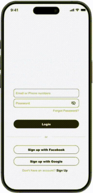
-This screen addresses a key user pain point: the need to open an account instantly, without the inconvenience of visiting a physical branch.
-The user wanted the ability to not only track transactions but also manage their account including actions like freezing their card to ensure transparency and control.
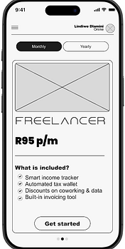
Presenting the user with the account they like and perks, this helps the user to decide without being stressed out.

A CTA button, signals moving forward where a user might have hesitation.
This element represents a button that allows the user to easily manage their account.

This element represents a live transaction profile, helping the user maintain transparency over their activity
Usability study: findings
I conducted a 2 sessions Usability studies where I focused on pain points of the users and added feature the can solve the problems they had
Round 1 findings
1. Users need clearer descriptions and guidance when opening an account.
2. Users need better navigation support (labels + home button)
3.Users need confirmation feedback for critical actions (freeze/unfreeze card).
Round 2 findings
Adding 1-line account descriptions reduces onboarding friction
Clear bottom navigation increases orientation and flow understanding
Adding screen of confirmation to let the user know if they freeze the account, let them confirm
Mockups After Usability
Based on usability insights, I added a labeled bottom navigation bar so users can quickly access Home, Accounts, Transactions, and Settings from anywhere in the app.
Before Usability Testing

After Usability Testing

Mockups After Usability
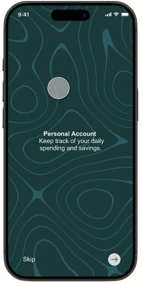
I added a brief onboarding carousel (3 screens) to introduce SEKTO’s core value props real-time visibility, simple account setup, and instant control so new users understand benefits before they start
Before Usability Testing
After Usability Testing

Final Designs


Takeaways
Impact:
The redesigned experience made users feel more in control and confident about managing their finances. One participant shared, “I love how easy it is to open an account without going to the branch it feels fast and effortless.”
What I learned:
Through this project, I learned the importance of grounding design decisions in user research and usability testing. I also discovered how small details like clear navigation and real-time feedback can greatly improve user trust and satisfaction in digital banking experiences.
Next Steps
Conduct another round of usability testing to evaluate the effectiveness of the high-fidelity prototype and gather deeper insights into user pain points before final development.
Expand accessibility features to ensure the app is fully inclusive, particularly for users with visual or motor impairments, by refining color contrast and adding voice assistance.
Introduce advanced banking features, such as budgeting tools and spending analytics, to help users make more informed financial decisions and increase engagement with the app.